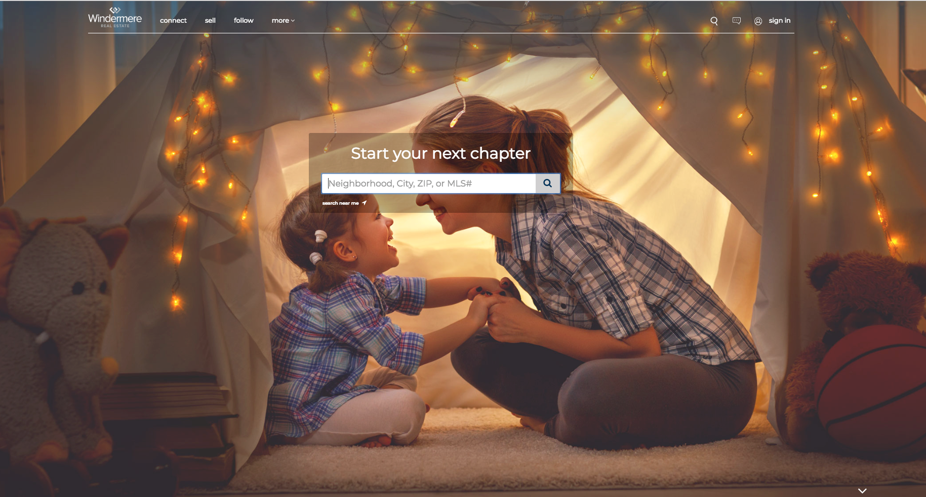
Around the halls of Windermere, we’ve decided that 2018 is the year to hit #refresh; it started with the launch of the refreshed Windermere brand earlier this year and today it continues with the unveiling of our refreshed website! The new Windermere.comis a result of a lot of research and input from our agents, franchise owners – and most importantly – consumers. As you can probably tell, we couldn’t be more excited! Let’s dig in.
Where we innovated:
Through the research process we discovered that over 85 percent of all traffic on our website occurs on our home page, search results, and property detail pages. This made it fairly easy for us to figure out what we wanted to focus on with the refresh. Plus, we heard from our regular site visitors that they felt those were the areas that needed the most improvement. Done, done, and done.
A much happier homepage:
We started with a total redesign of the Windermere.com homepage, which now better reflects the updated Windermere brand that we invested so much energy into earlier this year. The homepage is also now “location-aware” which means it will display listings that are geographically located closest to you. Because if you’re in Fort Collins, Colorado, you probably don’t want to be looking at listings in the suburbs of Boise. Catch our drift?
Mobile site, fast as lightning:
Next on the list to fix was our mobile site. We threw the proverbial baby out with the bathwater and started from scratch. The result is an ultra-fast, highly-optimized mobile site that we think might even offer a better user experience than our desktop site (although it’s next to impossible to pick which is better; please don’t make us do it).
Sexy search results:
OK, you probably wouldn’t normally describe search results as sexy, but it’s arguably one of the most important pages on our website, so we spent a lot of time here. What you see in your search results, and how those results are presented, has a major impact on your home search experience. We completely revamped how search results show up, as well as what you see when you click through to see a specific home. Is it the greatest search makeover of all time? Possibly.
Major eye candy:
As we all know, photos and videos are the beginning and end of everything these days, so we’ve placed even greater emphasis on those stunning images on our new property detail pages. We’ve also made it super easy for you to share listings that you love with your friends via social media, email, etc. because #sharingiscaring.
That’s it, go check it out:
Without further ado, we cordially invite you to check out our brand new website for yourselves by going to Windermere.com. If you’re someone who regularly uses our site, we hope you love it. If you’re someone who doesn’t typically use our site to search for homes, we hope you’ll give us a shot. If you feel like it’s completely on point, please let us know by emailing friend@windermere.com. If you don’t, we’d still love to hear from you! After all, any feedback is good feedback – but please, play nice.
Happy home searching!
Posted in Windermere by Shelley Rossi
 Facebook
 X
X
 Pinterest
 Copy Link


